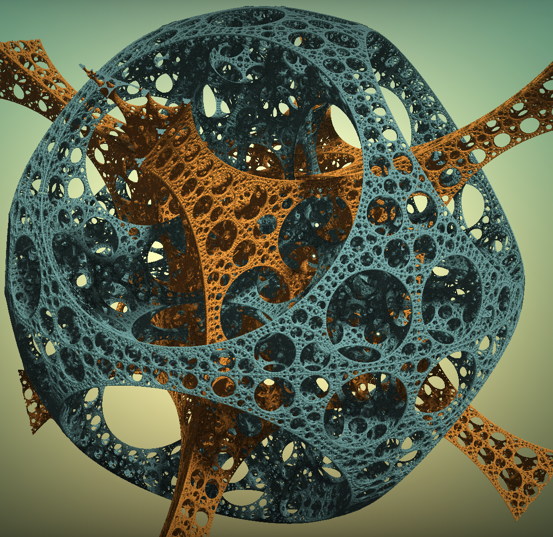
This classification of recursive shapes can be applied to inversive geometry in 3D, which is geometry that is symmetric to inversions around various 'generating spheres'. It is a 7x7 table that looks like this:
This is a set of random ideas that just want to jump out of my head and onto the internet. Who knows whether office chair philosophy is any more credible than arm chair philosophy, but you decide, and let me know.
Friday, April 11, 2025
Rules for Inversive Classes
Friday, November 29, 2024
Mean Voronoi blocks
Returning back to the article that implied that the most common 3D Voronoi cell would be cubic. From memory the paper found that the most likely 3D cell would have the topology of a cube. But that doesn't mean it has the geometry of a cube.
When taking the average geometry we need to rotate the objects first before averaging them.
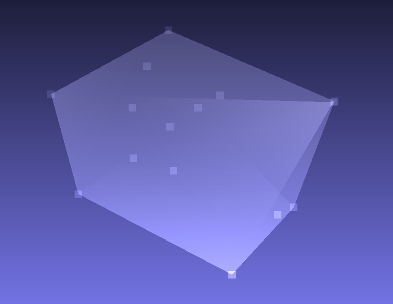
Here I do this by creating a random 3D delauney triangulation and picking out only those vertices with 6 edges (representing a 6-faced polyhedron, i.e. a hexahedron).
To average these hexahedra pairwise, I compare their face plane equations (meaning the vectors from the centre point to the face surface and orthogonal to the face. I currently compare ever permutation of these faces to find the closest. Before averaging these vectors.
There is a chance that these permutations could pick an illegal permutation, but I consider that to be quite unlikely. Nevertheless, that does mean the result still has a little bit of doubt remaining.
The result is not quite as I expected, in particular it seems to have one edge that is very close to being 0 in length:
-0.194 -0.799542 0.177-0.194 0.799542 0.177-0.0325489 0.0 -0.9198870.32221 0.0 0.866510.853741 0.0 -0.206742-1.80479 0.0 -0.206742
-1.72998 -0.656383 -0.859826-2.02784 -0.00848857 1.74037-1.72998 0.656383 -0.859826-2.02784 0.00848857 1.740370.674983 -1.25876 -0.9449221.04826 -1.00809 0.5965290.674983 1.25876 -0.9449221.04826 1.00809 0.596529
The shape has bilateral symmetry as expected.
While the topology doesn't look to be the same as a cube, any tiny deviation in the plane equations returns it to being cubic geometry.
So maybe (I might even say likely) the average 3D Voronoi cell looks like this. It being the modal topology and mean morphology.
Here is the version with mirror symmetry included, from side and top views:
As expected, it lacks the bilateral symmetry of the previous polyhedron.0.901108 -0.245847 -0.00362550.284537 0.768137 0.307837-0.0607338 -0.702541 -0.54646-0.238406 0.624325 -0.635057-1.78769 -0.245847 -0.0036255-0.149459 -0.245847 0.713359
-1.7839 -0.259842 -0.92409-1.67419 -1.07282 0.108903-2.01822 1.41839 0.813744-2.01419 1.38803 0.8857610.978475 0.0619286 -1.644780.557456 -1.51177 0.4251911.21246 0.908574 -0.9002791.02075 0.176343 1.10404
Wednesday, October 16, 2024
void-sponges
Void-sponges are probably the easiest self-siimilar shape to make with inversive geometry, but it isn't obvious whether there is a particular shape that is somehow a better archetype than others; something that is 'the canonical inversive void-sponge'.
It does exist and there are six of them. The trick is to realise that the most symmetric 3D structure is a 3-sphere, and that regular polychora (4D polyhedra) have evenly distributed vertices on the 3-sphere.
We therefore run the iterative inversions in 4D with sphere inversion centres at the polychora vertices, then stereographically project them back into 3D. This projection is conformal and Mobius so spheres remain as spheres. Any such projection will do, but in practice there is one that mimimises the object size by placing the pole on the face centre (farthest from the vertices), this also has rotational symmetry in 3D so is the best choice. Noting that it is structurally the same shape regardless of the Mobius transformation, and these inversive shapes should always be considered as equivalence classes under not just similarity transformations but also Mobius transformations.
So the six shapes come from the six regular polychora, the 5-cell:
The other free parameter is whole number n where the intersection angle between spheres is 180/n. For large n we get sparser shapes like above. And for smaller n they are thicker like below.There is also the 8-cell:
16-cell:Sunday, August 4, 2024
Pareto Olympic Results
Olympics time, and once again we see every news site in the country splash up the medals table. Invariably with USA or China at the top. The intention is clear that the top of the table are better at Olympics in some way. Sites might even refer to the top of the table as the Olympics winners.
This is unfortunate for two reasons. Firstly, there is no the medals table. Most of the world sort by golds, then by silvers then by bronze. Parts of the US sort by total medal count (for obvious reasons). The New York Times has suggested a weighting were one gold is worth two silvers, which is worth two bronzes.
The reason there is no one ranking is that the Olympics does not recognise any ranking table, not does it recognise a winning country. It only recognises medals to individuals. The ranking tables are not any official part of The Olympics, they are something pushed by the media, who presumably are more interested in political rivalries.
Anyway, the bigger reason this is unfortunate, is that total medals is an exceedingly unfair way to rank performance of a country. Tuvalu would need 30 thousand times the rate of medals to get the glory of matching the US on the medals table. Even larger countries like Iceland would need 900 times the rate of medal winning. The figures are even more skewed when compared to China. So why doesn't the media do the obvious thing and report medals per capita in the ranking tables?
We can get a clue by looking at the last five winners of the medals per capita (I'm using the NYT weighting here but it doesn't make much difference):
Dominica, San Marino, Grenada, Grenada, Jamaica
These are all very low population countries, and the winner varies a lot each Olympics. The problem is two-fold. Firstly, low-population countries will have far higher variance in their medal count than large ones, so the 'lucky outliers' will be small countries, and big ones like China would stand no chance of winning even if they have about the same quality of athletes, due to the lower variation.
Secondly, while this may seem unfair, the fact is that having the larger countries at the top of the table pleases more people, and so as a method is supported by more people. I'm sure that San Marino people would love to see the medals per capita plastered over the media, but their opinion is drowned out by a bigger market of people from the US and China who enjoy seeing their own country near the top.
So we are being pulled in two directions. Logic and fairness pulls us towards publishing the medals per capita, but popular interest and lucky outliers pulls us towards showing the total medal count.
This is a multi-objective problem, which can be resolved using the concept of Pareto fronts. The nice thing about this is that it admits multiple first-place 'winners' and multiple second places etc. None of these several winners can claim to be better than any other, so the slightly oppressive nature of placing every country in the world into a pecking order is relieved.
Anyway, here is how it works. In my case I will use the NYT medal weighting as the 'medals' count. The Pareto winning countries are those on the Pereto front of the two objectives: medals and medals-per-capita. They are the countries that: have more medals or more medals-per-capita than every other country.
So for any two Pareto winners, either can claim superiority to the other on one objective only, so it is a tie.
In order to get Pareto second place, we just remove the Pareto winners and apply the same search again. Likewise for third and fourth place, etc.
For 2024's Olympics we have:
- Pareto first place: Dominica, Saint Lucia, New Zealand, Netherlands, Australia, France, United States
- second place: Grenada, Bahrain, Georgia, Hungary, Great Britain, China
- third place: Slovenia, Jamaica, Croatia, Norway, Sweden, South Korea, Italy, Japan
They are in population order. The table now is satisfying for people from large and small countries.
We can see that the usual hegemony of US/China is replaced by a hegemony of New Zealand, Australia, Great Britain, and United States. Also with winning by Grenada, the Bahamas, Netherlands and Russia.
It is actually rather sad to see that there is still Anglosphere privilege throughout the Olympics, and it isn't as egalitarian as the Olympic Committee (and the world) would like it to be. But at least now this hegemony is visible, it is not just USA battling it out with China.
Media companies would do well to present the Olympics this way. It shows what is really going on, and gives honour to some of the smaller countries with incredible rates of medals.
Update: This is a different attempt to solve the same problem with total medals and medals-per-capita by trying to find a happy medium between the two extremes. I don't think it is the best answer for a few reasons- 1. it rates all medals the same regardless of colour, 2. it uses a model that is at the same time too complicated for audiences to adopt and too simple to represent what's going on. For instance it assumes all actions are independent. 3. it continues to squeeze all countries onto one strict ordering, rather than treating the medal rates of tiny and huge countries as effectively incomparible.
Tuesday, April 9, 2024
Mixed Fractal Surfaces
It is possible to have a fractal surface which varies in local dimension everywhere. That is to say, on any patch of the surface you can zoom into a rough area (e.g. 2.5D) or zoom into a smooth area (2D).
Here it is applied to the sphere tree fractal:
and to the non-rotated one:In both cases the the smaller spheres are disproportionately smaller than in the usual shapes, giving a surface that tends to smooth in the vicinity of each sphere base.Saturday, April 6, 2024
Scale-based decompositions
There are several ways to decompose a smooth function. A spline, a Fourier decomposition, a Taylor decomposition per-point, and a Pade decomposition per-point, are the first that come to mind. Also a perceptron (Sigmoid decomposition).
All of these are suited to smooth functions. However nature isn't smooth, and tends to exhibit scale-symmetric roughness in some form. Can we extend some of these useful decomposition methods to support roughness?
The way I'm considering doing this is to treat scale as like another dimension. For example, if our function is 1D: $y = f(x)$, then a new axis $s$ represents scale.
As scale is a logarithmic sort of attribute, we have to treat it as such. We treat the function f(x,s) as the convolution of f(x) with the Gaussian $g(x) \leftarrow N(0,\exp{s})$, and whenever we take the partial derivative $d$ with respect to $s$ we use the logarithm: $\log{|d|}$. The modulus operation is because the logarithm is a function on the magnitude of $d$, representing the entropy of $d$.
This $\exp$ and $\log$ pairing linearises the scale component of the function.
We can now do something like a 2D Taylor decomposition of the 2D graph with respect to $x$ and scale $s$. This is a sort of partial derivative that can be looked at in a systematic way:
$f(x,s)$ is the height of the function (mean height of the patch)
$\frac{\partial f}{\partial x}$ is the gradient of the function
$\frac{\partial f}{\partial s}$ is the change in (mean) height with change in s, which is zero
So far not very interesting. But we can go further:
$\frac{\partial^2f}{\partial x^2}$ is the curvature of the function with respect to $x$
$\frac{\partial^2f}{\partial s^2}$ is the change in $\frac{\partial f}{\partial s}$ with scale $s$, also 0
$\frac{\partial^2f}{\partial x \partial s}$ is the change in gradient with respect to scale $s$
Now normally this last one would also be zero, but we are using the absolute value of $\frac{\partial y}{\partial x}$, so it is $\frac{g(x)\star\log{|\frac{\partial y}{\partial x}|}}{\partial s}$, which represents how much the average absolute gradient changes with scale $s$.
This is non-zero because larger $s$ (lower-pass signals) has lower mean absolute gradient than high-pass signals for rough functions. This is a way to measure the fractal dimension of the function, since it is the slope of a log-log function. It is only non-zero on rough surfaces, and zero on smooth ones.
This may not seem interesting, but it is starting to incorporate fractal functions and smooth functions into the same framework. This is a sort of Taylor expansion at a point, but it can also be applied piecewise as the basis for approximating a whole 1D function. We can now treat a function as a set of heights quadratically interpolated, and each with their own fractal dimension, so they are rough curves. Moreover, this piecewise decomposition is a mesh in 2D with scale s, giving a different set of slopes and fractal dimensions at different scales.
This is already very powerful, it supports roughnesses that change with location and with scale. Moreover we can see a link with splines, since piecewise linear approximations are first-order splines. But we can keep going:
$\frac{\partial^3f}{\partial x^3}$ is the rate of change of curvature, used in cubic splines for instance
$\frac{\partial^3f}{\partial x^2 \partial s}$ is the change in curvature with scale, I think this quantifies a C(1) fractal, representing not rough but lumpy functions. However I'm not sure!
$\frac{\partial^3f}{\partial x \partial s^2}$ is the change in fractal dimension with scale. Does it get rougher or smoother as you zoom in. This is connected to my Saturated shapes blog post.
$\frac{\partial^3f}{\partial x \partial s \partial x}$ how the fractal dimension changes with $x$, this allows linear roughness changes along the function.
$\frac{\partial^3f}{\partial s^3}$ this is zero
This next level of Taylor expansion can characterise the curvature of the function and the change in roughness.
There are lots of ways this idea could be extended:
- Look at Pade decomposition instead, or Fourier decomposition
- Extend to a 2D function (like a hillside), this adds many more partial derivatives
- Look at the topological groups instead, e.g. -ve, 0, +ve in each component of the Taylor expansion
For the 2D case:
$\frac{\partial^2f}{\partial x \partial z}$ - twist or saddleness
$\frac{\partial^3f}{\partial x \partial z \partial s}$ - very weird idea, how much does saddleness change with scale
$\frac{\partial^3f}{\partial x \partial s \partial z}$ - how much does $x$ fractal dimension change with $z$. Noting that roughness can be different in different axes
We can then have a linear sum of all of these primitive values. Topologically we we can set each to -1,0 or 1, to give us a set of derived shapes.
Tuesday, March 5, 2024
A tree-solid
A tree-solid is a scale-symmetric shape which is a tree (acyclic, no holes) but fills the full area of space.
It is the set complement of a void-tree which is what we usually call fractal trees. So people usually just make fractal trees like the Vicsek fractal:
But making one primarily as a tree-solid makes you consider the shape of the solid regions it is built off. In the case of this post, it is disks.